
Imagine a classroom where every student can fully participate, engage, and succeed. This is the heart of modern education. It’s not just about ramps and elevators anymore. True learning equity means designing experiences that work for everyone from the very beginning.
When we build with inclusive design in mind, we create a better, more flexible experience for all learners. Features like video captions, for example, help students focus and provide access in noisy environments or quiet libraries. This approach boosts engagement, improves knowledge retention, and leads to higher achievement across the board.
This foundational principle is often called resource accessibility. It’s the cornerstone of a fair and effective educational system. Consider that roughly 15% of Americans live with a learning disability, highlighting the scale of potential exclusion without thoughtfully created accessible learning spaces.
By embracing universal design, we move beyond seeing accommodations as an add-on. We start building learning that is inherently more powerful and equitable for every single person in the room.
Designing Inclusive Content
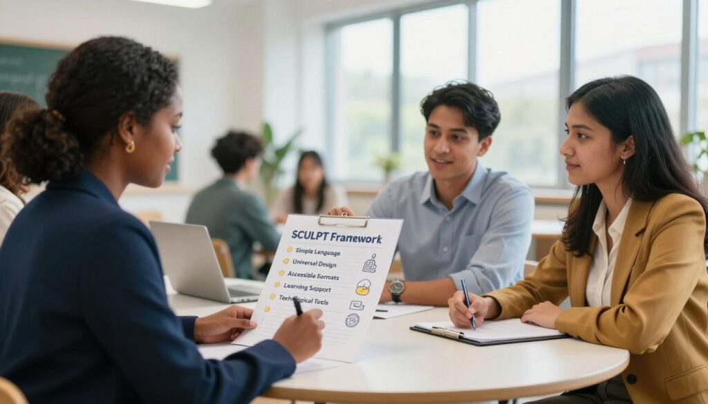
Inclusive content design makes learning easier for everyone. It starts with creating materials that are easy to use from the beginning. The SCULPT framework is a great tool for this. It helps you make content that supports educational accessibility well.
SCULPT stands for six important principles: Structure, Colour contrast, Use of images, Links, Plain English, and Tables. Let’s look at each one with simple tips.
- Structure
Use proper heading tags (H1, H2, H3) to organize your content. Don’t just make text big and bold. Screen readers need this structure to help users.
- Colour Contrast
Make sure text and background have enough contrast. Avoid light grey text on white backgrounds. Good contrast helps those with low vision or color blindness.
- Use of Images
Every image should have descriptive alt text. Don’t leave alt text empty or use generic names. Good alt text helps those who can’t see the image.
Write link text that clearly describes where it goes. Avoid vague phrases like “click here.” Descriptive links help everyone, including screen reader users.
- Plain English
Use simple, clear language. Avoid jargon and long sentences. This makes learning easier for everyone, including non-native speakers and those with cognitive differences.
- Tables
Use tables for data, not for looks. Always label rows and columns with header cells. Simple tables are easier for everyone to understand.
Following the SCULPT framework is about making thoughtful choices. Each choice helps remove barriers. Good structure and clear language make learning more accessible.
These design choices make learning experiences more inclusive. By using these practices, you actively support educational accessibility for all students.
Tools for Increasing Accessibility
Resource availability in education relies on the right tools for everyone to access content. Great ideas need the right support to reach every learner. This section explores practical tools and strategies that empower creators.
These solutions fall into two main groups. First, there are the assistive technologies students use daily. Second, there are the creation and checking tools educators and designers use.
Assistive Technologies Students Use
Tools like screen readers and real-time captioning are vital for many students. They rely on well-structured content to work properly. A clear heading hierarchy and descriptive links are not just nice extras. They are essential for these technologies to interpret information correctly.
Audio descriptions for videos and keyboard navigation are other key examples. When content is built with these tools in mind, it becomes usable for everyone. This foundational step ensures no one is locked out of learning.
Thankfully, many powerful tools are already at your fingertips. The goal is to ensure materials are born accessible from the start.
Your choice of file format is a critical first decision. Some formats are inherently more flexible than others. Prioritizing HTML or Microsoft Word documents over PDFs is a smart move. These formats are easier for screen readers to process and for users to adjust.
Most software you already use has built-in accessibility helpers. Microsoft Word’s “Accessibility Checker” is a perfect example. Learning Management Systems (LMS) like Canvas or Blackboard also have similar features. They can scan your content and flag issues like missing image descriptions.
Don’t work in the dark. Guides like the University of Waterloo’s Course Accessibility Guide offer step-by-step advice. They show you how to check your courses and where to request support.
For larger projects, consider engaging with an Agile Development Team. These teams can help audit digital resources and implement fixes efficiently. They turn accessibility from a solo task into a collaborative mission.
| File Format | Screen Reader Compatibility | Ease of Editing & Adjusting | Best Use Case |
|---|---|---|---|
| PDF (Scanned/Image-based) | Poor. Often reads as a blank image without proper tagging. | Very Difficult. Requires specialized software to edit. | Avoid for primary content. Use only for final, print-ready documents that are also provided in another format. |
| Microsoft Word (.docx) | Good. Works well when styles (Headings, Lists) are used properly. | Easy. Users can change fonts, colors, and spacing to suit their needs. | Excellent for worksheets, readings, and drafts where editing is expected. |
| HTML (Web Page) | Excellent. The native language of the web, designed for flexibility. | Very Easy for users. Browser settings allow for deep customization of text and layout. | Ideal for core course content, syllabi, and any information posted online. |
Using the right format dramatically improves resource availability. It removes barriers before a student even encounters the material. This proactive approach saves time and frustration for everyone later on.
Remember, these tools are here to empower you, not burden you. Start with one checklist or use one built-in checker in your next document. Small steps with the right tools lead to big improvements in access. By leveraging these resources, you make sure your valuable content reaches its full, intended audience.
Real-world Examples
Let’s look at how some schools are making learning online more fair. Seeing these efforts in action gives us a clear guide to follow.
The University of Kentucky made a big move by creating standard course templates. These templates include accessibility features from the start. This ensures every course has a solid base for equitable learning.

When the pandemic hit, Constructor University quickly moved to online learning. They used digital tools to support all students. This shows that making learning accessible is possible, even in tough times.
Many schools are now making learning online more accessible. They work with tech companies to get the right tools. They also teach teachers why making learning inclusive is important.
A student shared their thoughts: “We need chances to try different ways of learning. It makes us feel more comfortable and helps us learn better.” This quote highlights the importance of student success. Giving students choices and practice is crucial for equitable learning.
These actions ensure all students have equal access to quality learning. It makes the academic field more even. When resources are made for everyone from the start, it creates a fairer learning environment. This is the essence of equitable learning in action.
For more ideas on supportive tools, check out this resource on assistive technology and adaptive tools. Also, see how community programs like digital outreach programs are helping to close the access gap beyond school walls.
Striving for Continuous Improvement
Creating an accessible learning space is a journey, not a quick fix. It’s about making steady progress, not achieving perfection right away. Focusing on growth makes the journey easier and more lasting.
Begin with one change. Maybe learn one SCULPT principle this semester. Then, add another next term. This way, you build confidence and create lasting habits. It breaks down a big goal into smaller, achievable steps.
Standards like the Web Content Accessibility Guidelines (WCAG) keep getting better. These updates give us clearer, worldwide standards. Keeping up with these changes helps improve your methods over time.
This dedication to always getting better is what makes learning fair for all. It means your educational materials stay open and useful for everyone. True accessibility is a promise to your learners, not just a one-time task.
Your next move is straightforward. Find one small obstacle in your content. Think about how you can remove it. This small action brings us closer to a more inclusive learning space.